
The Exhibit Hall at ISC West can be overwhelming if you don't go in with a plan. Before booths start...

You rely on The Boring Toolbox for complete visibility into your video security system. Until now, that critical health data showed up as dashboard tiles, reports, alerts, or snapshots.
Super useful, but a little “in the moment.”
Now, with Analytics, you get the bigger picture.
It takes everything The Boring Toolbox already knows about your system and turns it into charts that help you visualize trends over time.
Not just more data.
More context and more understanding.
We have a customer whose earned the nickname “Data.”
Not because it was his job title.
But because when something broke, he showed up with receipts. #respect
When storage started behaving strangely, he didn’t guess.
He didn’t argue.
He didn’t shrug and say “it feels like it started a while ago.”
He pulled out months of saved Boring Toolbox reports.
Spreadsheets.
Daily snapshots he had been quietly collecting over time.
He could say, confidently:
“This started on this exact date. Here’s the proof.”
And it worked.
Problems got solved faster. Conversations changed. Vendors listened.
But let’s be honest, that workflow was… heroic.
While we truly respect the effort, all that cross-referencing goes against our #1 principle for building The Boring Toolbox: don’t make me think.
And so, we got to thinking… and building.
Now, Analytics exists so you don’t have to be “Data” to get data-driven answers.
When you open Analytics, it should feel very familiar.
You’ll see the key system health metrics you know and love, presented as clear, easy-to-understand tiles. Consider this overview section your triage panel.
Here you get system-wide averages for recorder uptime, camera uptime, live storage, and retention, so you know exactly where to start digging deeper.
This is still The Boring Toolbox philosophy at work:
Open one place ➜ Scan quickly ➜ Know whether to dig deeper
Once you’ve scanned the overview and spotted an area that needs attention, it’s time to drill down.
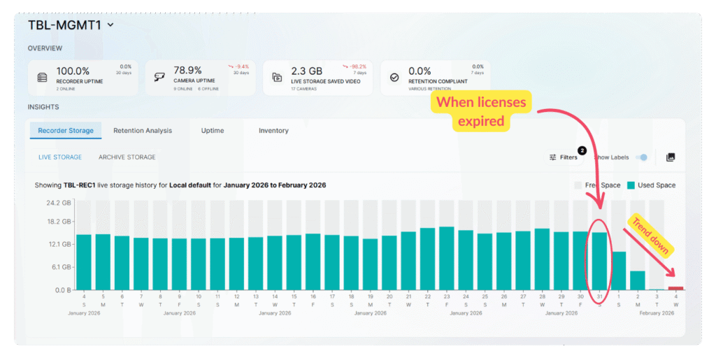
Analytics makes it easy to jump straight from a high-level metric to detailed charts for recorder uptime, camera status, storage usage, or retention compliance.
You can filter by site, recorder, camera, or date range to quickly pinpoint what’s changing, where, and why.
Whether you’re troubleshooting a dip in uptime, investigating storage issues, or checking retention compliance, you move from “What’s going on?” to “Here’s what’s driving it”—all without leaving The Boring Toolbox.
Now, let’s take a look at all of the new charts and break down what you can learn from each.
Instead of jumping between screens or correlating data across reports, analytics lets you drill in.
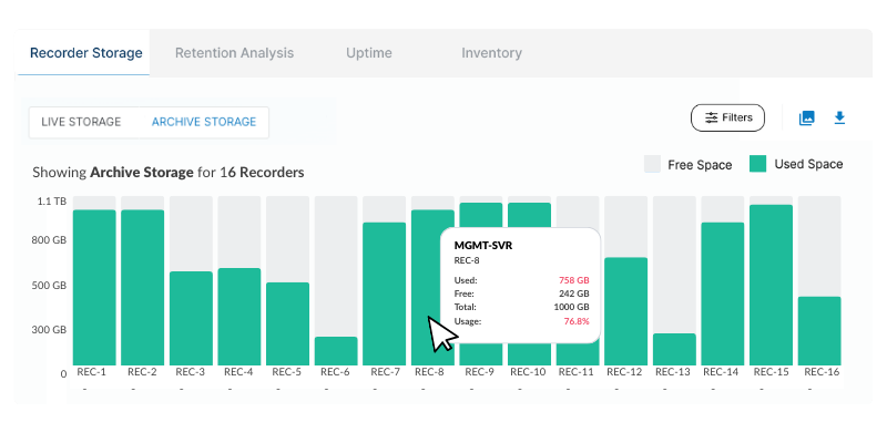
See exactly how storage is distributed across your recording servers. Not just which ones are below a threshold, but where capacity is tight and where there’s still room to grow.
That makes it easier to:
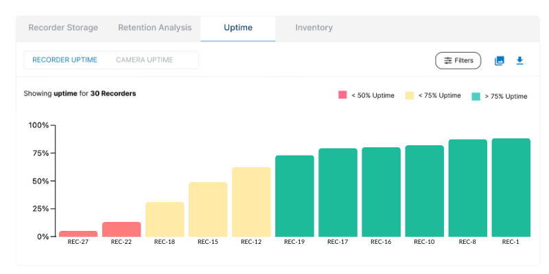
Knowing your overall uptime is good. Knowing which cameras or recorders are dragging it down is better.
Analytics makes it easy to pinpoint whether the issue is just a few problematic cameras, a bigger site-wide or recorder issue, or systems that look “up” but have actually been flapping in and out for months.
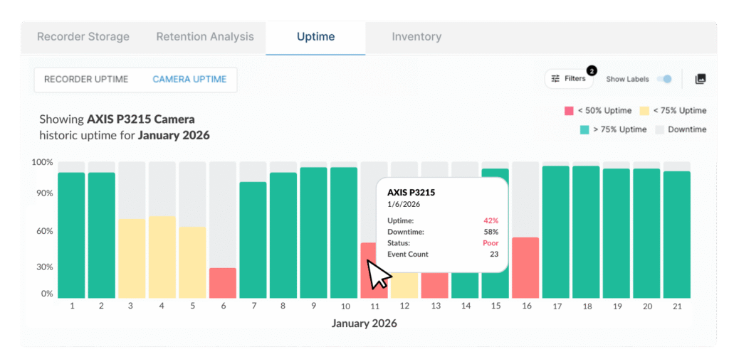
No guesswork. No assumptions.
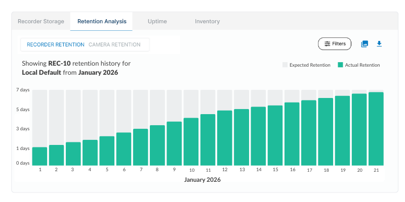
Analytics gives you a historical view of actual retention versus expected retention, and lets you quickly drill down to the cameras or recording servers that are falling short.
That’s often where the real story lives.
Is storage full? A configuration change? A sudden spike in data?
If your storage is full and your retention isn’t meeting expectations, that’s a sign that you need to invest in more storage or reduce your retention requirements.
Or perhaps you manage the cameras on a school campus. Being able to visualize retention trends during summer break versus fall start is invaluable data that can help you anticipate storage needs, adjust retention policies, and make sure critical footage is always available, no matter the season.
Live data tells you what is happening.
Historical data tells you when.
Analytics lets you look back over weeks or months and see:
Analytics keeps that history visible and actionable.
No more trying to remember what “normal” looked like three months ago.
No more recreating timelines from memory.
Analytics wasn’t built to impress you with complexity.
It makes the data you already rely on easier to interpret.
You see the signal.
You follow it.
You act.
That’s the workflow.
You spend less time searching for answers and more time doing… literally anything else.
If you’re already using The Boring Toolbox, Analytics is waiting for you. If you’ve been running Boring Toolbox for a while, your historical data will already be locked and loaded.
Open it.
Look back a little.
You might be surprised by what your system has been trying to tell you all along.
And if you’ve ever wondered:
We have answers for you.
Try The Boring Toolbox for free today with a 30-day free trial.
We built The Boring Toolbox to eliminate manual reports, but we know small systems need spreadsheets.
Template includes:

Your go-to XProtect eXPerts. We learn the technical stuff that will save you time and make it less boring.
Your go-to XProtect eXPerts. We learn the technical stuff that will save you time and make it less boring.
The Exhibit Hall at ISC West can be overwhelming if you don't go in with a plan. Before booths start...

Spread a little love (and laughter) in the security world. Download free, not-at-all-creepy Valentine’s Day cards made just for security...

This blog introduces Analytics, a new feature in The Boring Toolbox that brings powerful trend visualization to Milestone XProtect. Learn...